Drawing Trendlines
 Trendline analysis can help to identify potential support and resistance areas on stock charts. Not only do trendlines help identify support and resistance areas, but drawing trendlines on charts can also identify chart patterns.
Trendline analysis is very versatile as trendlines can be drawn on 5 minute charts, hourly charts, daily charts, weekly charts and even monthly charts. The time frame depends upon each investors trading strategy. A day trader may be more interested in minute and hourly charts whereas a long-term investor relies more upon weekly and monthly charts.
When drawing trendlines on a stock chart, don’t be afraid to really mark it up by drawing several of them, like I did on the below 2 year daily candlestick chart for Apple. Until I get a good feel for a stock chart and its activity, I usually have up to dozen trendlines drawn on it to try and identify the true support and resistance areas.
Stay Organized
Because of the numerous number of trendlines, being consistent with the colors can help you to analyze your chart quicker and with more confidence. To help clarify the mess of trendlines, here are the standard colors that I always use:
- Green trendlines are for supporting trendlines
- Red trendlines are for resistance trendlines
- Purple trading channels represent price gaps (gap-ups and gap-downs)
This is a 2 year weekly candlestick chart for Apple (AAPL).

Drawing Trendlines on Apple’s (AAPL) 2 Year Daily Candlestick Stock Chart To Identify Support & Resistance Areas
As you are getting started with drawing trendlines, let me provide you with one of my most helpful trendline tips. This tip is based on my years of market observations while using trendlines.
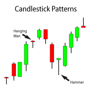
I do not like to rely on trendline convergence areas alone though. I like to supplement trendline analysis with other types of technical analysis. Methods that work well with trendline analysis are chart pattern identification and candlestick patterns. Does the information from these methods corroborate the trendline analysis? If so, there is a greater likelihood for the expected outcome of the trendline.
For example, I typically like to see a bullish reversal candlestick pattern develop on supporting trendline after a stock’s share price has been pulling back. The bullish reversal candlestick pattern supplements the trendline analysis and would indicate that the stock’s share price is going to bounce from the supporting trendline.
Grab your own favorite stock chart and start drawing some trendlines on it. Look for areas of convergence and analyze the activity subsequent to the convergence. If you are new to drawing trendlines, I recommend reading through the guidelines for drawing trendlines first.
Drawing Trendlines – Guidelines
Drawing trendlines on stock charts is usually done one of two ways.
- Using the intra-day highs and lows for the share price
- Only using the closing share price


Notice the slightly different placements of the two trendlines above. This results in two slightly different “support” areas. Since the trendlines may be at slightly different angles, the support areas will start to differ as time passes. As more and more time passes, the differences between the support areas will become even more pronounced.
I have found that learning to be versatile helps me consistently find support and resistance areas. For example, I may at times use a combination of intra-day highs/lows and closing prices for a single trendline.
Trendlines – Broken Support & Resistance
As a general rule, once a stock closes below a supporting trendline it will turn into a resistance area rather than an support area to support the stock’s share price. The opposite holds true for a resistance area. Once a stock closes above a resistance area, that resistance area usually turns into a supporting area for the stock’s share price.
If you look at the above chart for Apple once again, notice that just recently AAPL broke through its overhead resistance trendline. Its share price pulled back to the overhead resistance trendline one time before surging again above the $112.39 area.
Some trendline breaks are buying opportunities. Others are sell signals. If you don’t know the difference, then consider joining Trendy Stock Charts. I can show you how to properly identify trendline breaks as either opportunities or risks by using other methods of technical analysis to supplement the trendline analysis.


