Well, that really stunk. A new battery that was on backorder for my Apple laptop came in during the week and I had to turn in my laptop for a couple of days to have them install the new battery. The out-of-stock battery was not supposed to be here until April due to supply constraints; and because of that long delay Apple was going to install the new battery free of charge.
I dropped off the laptop Wednesday last week, the day of Facebook’s earnings. They had a quick turnaround though as I was able to pick it up Friday evening. They did not charge me even though there was no constraint on the battery supply as Apple had anticipated. That gracious event saved me $200 plus taxes on a new battery. Thank you Apple! They must know I usually write a lot of positive articles about the company and its stock (well, maybe not as so much lately).
So while Apple’s customer service may be “hot”, their chart sure isn’t. After reaching a high of $180ish it appears to have started a consolidation. I will save individual charts for later updates. This update will try to take a look at a few different sectors to see what may be not and what will probably be not over the next couple of months.
If you missed it, I posted a NASDAQ chart last week in the Idea Chamber that suggested a correction could start at any point since the minimum requirements for the uptrend had been met. I think the next few months could very well be a period of “sector rotation” as they say in the financial news. A period of sector rotation involves selling stocks that have performed well over a given time period and then using those proceeds to reinvest in underperforming sectors over that same time period. A sector rotation is definitely preferred instead of a bearish correction of more than 15%.
So let’s look at the charts for a couple of major industries and sectors and see what may be in store for our portfolios….
Financial Sector
This first chart is taking a look at the financial sector including banks. It is a chart of the Financial Select Sector SPDR ETF, ticker symbol XLF. It is a 3 year weekly candlestick chart for the sector.

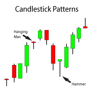
A Bearish Engulfing Candlestick Pattern on a Weekly Candlestick Chart Is Bearish, At Least Short-Term
The Bearish Engulfing candlestick pattern was confirmed by selling volume that was greater than the previous week’s volume, a sign that points to confirm at least a short-term consolidation period. However, this consolidation period should be viewed as an opportunity to [s2If !current_user_can(access_s2member_level1)]……
If you want to continue reading this article on what’s hot and what’s not in the market right now, then you must first login.
I review and discuss the long-term charts for gold and the NASDAQ Composite in the rest of this update.
So you are not a Trendy Stock Charts member? Then consider joining today! There are several different subscription plans available and I’m sure there is one that suits your needs.[/s2If][s2If current_user_can(access_s2member_level1)]pick up some shares until the ETF makes a new high. The gray shaded box represents the best probable pullback area for the index.
If you purchase shares at the top of the gray shaded box, save money for a possible second scale-in purchase at the lower end of the box.
Again, hold these shares until at least a new high is made. Then ask for another update. It might be best at the new high to trim shares and lock in gains, but I always like to re-analyze a chart when it reaches my price targets. But with additional rate hikes on the horizon for 2018, bank stocks and the banking sector should do well.
Gold
This next chart is a 20 year monthly candlestick chart for gold futures. Gold has been in a multi-year downtrend that appears to have bottomed out in July 2015. However since bottoming out in July 2015, the long-term downtrend and chart has been showing signs of a turn-around. Trendy Stock Charts members have traded through this potential turn-around with IAG.
From a bullish standpoint – if at any point in the next couple of months the chart breaks above its high from July 2016, get as long as possible and stay long for several months. A print of $1,377.51 is confirmation of the new uptrend.
A new uptrend should take the metals price back towards its high in 2010 and form the right side of a Cup pattern. That would represent a possible 50% gain over the next 1.5-2 years. If it takes 2 years, thats an 25% approximate gain per year, a higher return if it takes less. That also doesn’t take into account the 1-2 major trades during the uptrend to try and take advantage of as well (Waves 2 and 4 in an Impulse Wave).

A 20 Year Monthly Chart for Gold Futures Analyzing Its Long-Term Pullback With a Fibonacci Retracement Tool
The long-term uptrend from $253 to its high $1,923.70 finished a 50% retracement at the end of 2015. Gold has since been in a general uptrend but it if you stayed invested in it at all times you underperformed the market. Just like any stocks, there are good times and better times to hold a stock.
We have seen the index get close to breaking out through my charts with the gold miners, I Am Gold (IAG) in particular. IAG has had periods of breakouts but has then pulled back and given back its gains. Things may permanently change for the better soon though if the gold futures confirm a breakout with a $1,377.51 print.
If gold does breakout, the gold miners should definitely follow, and at possible higher percentage gains than the metal itself. IAG has been a Trendy Stock Charts favorite, but if you have another let me know!
NASDAQ Composite – Point & Figure
Let’s end this update with a Point & Figure Chart for the NASDAQ Composite. Earlier today I posted a weekly candlestick chart in the Idea Chamber that suggested there was a little buying momentum left. If that’s the case, a re-test of the previous high should be in order. That should be an even that is sold into IMO. Let’s see if the couple days of sell-off from the end of last week have had an affect on the P&F Chart for the index.
High/Low P&F Chart – A bullish price objective of 7,199 has been met
Closing P&F Chart – A bullish price objective of 6,499 has been met
Both P&F Charts for the NASDAQ show a new column of O’s. That means the pullback was significant enough to change the trend on the P&F Charts for at least the short-term. Does that mean the consolidation has started? The signs are pointing towards yes.
Summary
Be extremely careful with any new purchases of individual stocks as a possible market consolidation period begins. Some stocks may fare better than others during the consolidation, so be sure to send a request for an update on any individual company you may be interested.
I imagine that some sectors will do well while others faulter, creating a “go nowhere” market for a couple of months. I will look at the NASDAQ’s charts again this week and provide a more detailed update after I am done.
But starting to build a longer-term position with gold and jumping in on the bank stock trades looks promising so far.
I will continue this update in Part 2 later today with oil and some other major sectors. I did not want to hold up all the charts while I keep reviewing some others….
[/s2If]


1 Comment
Leave your reply.