NASDAQ Composite – Distribution Days

An Excerpt From Investors.com that Summarizes the Number of Distribution Days and Also Price & Volume Action for Market Leaders
As requested in the Idea Chamber, let’s check in and review the status of the overall market. I will use the NASDAQ Composite charts for this review.
But before looking at any charts, let’s discuss distribution days and how they can help you to monitor the health of the market.
I visited investors.com, clicked on the “Market Trend” menu option and then selected “The Big Picture”. Investors.com does an excellent job with their analysis and reporting of distribution days.
If you create a free account with Investors.com you can then sign in to read “The Big Picture” stock articles and see the number of distribution days listed by index.
Per my Stock Market Terms & Definitions page, a distribution day is defined as
The loss of more than 0.2% by a major index during a single trading session as selling volume ticks higher than the prior trading session’s volume.
Distribution days should be traced separately between the NASDAQ Composite, the NYSE composite and the S&P 500.
Tracking the accumulated number of distribution days is crucial to gauging a market’s health. Why? Because when the number of distribution days starts adding up, it almost always signals that large institutions and investors are starting to exit the market.
Large institutions can include pension funds, money managers and investment bankers. And since these large institutions control the bulk of the daily trading volume due to the relative size of their portfolios, the tend to influence the market’s overall direction. You can’t expect stocks to rise without those big guns on your side.
How many distribution days is too many? When an index gets near 8 distribution days, that usually indicates a correction is imminent or has already started. Currently, the S&P 500 has 6 distribution days and the NASDAQ Composite has 5. Investors.com lists this high count as “Uptrend Under Pressure”.
NASDAQ Composite Cup With Handle
My previous article for the NASDAQ Composite focused on a breakout from its Cup With Handle chart pattern. The NASDAQ Composite Cup With Handle chart pattern I illustrate is a 15 year Cup with an almost 2 year Handle.
The article can be quickly accessed here “2/11/2017 – NASDAQ Composite (COMP) 15 Year Cup With Handle“.
In that February 11 update, I made reference to the 5,850 price level for the index. This is a price level that the NASDAQ Composite has struggled to break through in the recently over the last couple of weeks.
This is a 20 year monthly candlestick chart. It shows a MACD Histogram that still reflects longer-term buying momentum in place, even though the index has been struggling to break through the 5,800 – 5,900 price area. Historically, even as the buying momentum starts to slow, which it has not yet done, the price for the index should continue to rise for a little while. That indicates higher prices still.

Analyzing Long-Term Upside Price Targets for the NASDAQ Composite Using Fibonacci Extension Tools
Normally, I have multiple Fibonacci Extension Tools on a chart. But I only have 2 on this chart which I want to focus on. The black Fibonacci Extension Tool is the longest-term tool I have for the index.
Anchor Point #1 for the Fibonacci Extension Tool is actually off the left side on the above chart. Anchor Point #1 is set at 690.95 on June 22, 1994, but Think or Swim limits chart activity to a 20 year period so I cannot capture Anchor Point #1 in the chart. That means I placed the black Fibonacci Extension Tool on the NASDAQ’s chart at least 3 years ago, probably more like 4 years.
But what I want to calculate the longest-term Golden Ratio calculation I can. I feel that this Golden Ratio is the most likely price target for the breakout from the Cup With Handle chart pattern. The longest-term Golden Ratio is represented by the black 161.8% Target Line above, or the 8,294.95 price level.
In my previous NASDAQ update, I came up with an estimated 7,000 price level. Could the upside potential be closer to 8,200 – 8,600 price area?
NASDAQ Composite
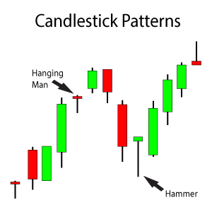
This is a 1 year daily candlestick chart for the NASDAQ Composite (COMP). I’ve identified 2 bearish candlesticks on this chart, both of them are Bearish Engulfing candlestick patterns. These are bearish reversal candlestick patterns that indicate the uptrend is over or near over in the short-term. I say short-term because this is a daily chart where I’ve noticed these bearish reversal candlesticks.

Analyzing Short-Term Overhead Resistance at 5,935 Created by 2 Bearish Engulfing Candlestick Patterns
Volume is not included on the below chart since Think or Swim, my trading platform, does not provide volume for the indices. However a quick check on Investors.com and I see that both of the Bearish Engulfing candlestick patterns developed on selling volume that was greater than the previous candlestick’s total volume.
This volume confirmation indicates that the NASDAQ may continue to see a little volatility over the next couple of weeks as earnings season gets underway. It may even sell-off a little based on these bearish items.
If the NASDAQ Composite does sell off some, the 5,750 area looks to provide short-term support. The 5,750 area is where a Rising Window candlestick pattern developed and still has an open window or gap. A Rising Window candlestick pattern is a bullish continuation candlestick pattern that typically provides a strong support area.
NASDAQ Composite Summary
In summary, the number of distribution days and bearish candlestick patterns on the daily chart indicate a probable further consolidation period and some slight volatility.
The support area from the Rising Window candlestick pattern at the 5,750 price level should provide support for the current short-term bearishness. If the pullback sees any sort of selling volume, it could break the 5,750 price level and reach the 5,550 price level. The 5,550 price level is the top of the 100% Target Line from the longest-term Fibonacci Extension Tool.
In my opinion, if the NASDAQ Composite is going to reach the 7,000 or 8,000 long-term price targets I’ve calculated, the index should not see much more of a pullback than the 5,550 price level. Any break of the 5,550 support level on heavy selling volume is a cause for concern. We will want to start exiting positions on any bounce after the 5,550 price level is broken. A longer consolidation period is very probable at that point.
 But I do not believe that a longer consolidation period is in the cards yet. The breakout from the NASDAQ Composite Cup With Handle chart pattern that took 15 years to develop does not end at the 5,850 price level. That would represent a breakout from a 15 year pattern that only lasted a little over 6 months. That just doesnt seem like a long enough breakout based on the size of the Cup pattern. Rather, I believe the uptrend ends at a higher price target that is still further down the road.
All signs point towards still “buying the dips”…..monitor the 5,750 and 5,550 price levels for support as mentioned above.


2 Comments
Leave your reply.