Nestle (NSRGY) Stock Chart Review
 As requested through email from a trial member, this next article will be a Nestle (NSRGY) stock chart review and analysis.
Whenever I think of Nestle, I think of their milk chocolate candy bar. A frozen one was even better. But I had to be careful hiding it in the freezer as I had 2 younger siblings growing up that were eager to take the candy bar off my hands…
Baby Ruth, Butterfingers, Nestle Crunches and the standard Milk Chocolate Bars….those are still my favorite Halloween candy bags to purchase, just in case there are any left-overs.
While I could go on about my love affair with candy bars dating back to when I was a kid, its probably best to move on to the actual stock article for Nestle.
This Nestle (NSRGY) stock chart review will take a look at medium-term trends and longer-term trends using weekly and monthly candlestick charts, respectively.
NSRGY – 20 Year Chart
This first chart is a 20 year monthly candlestick chart for Nestle (NSRGY). I always like to know where a stock price has been over the last 20 years. It is amazing how support and resistance areas from years ago still matter today.
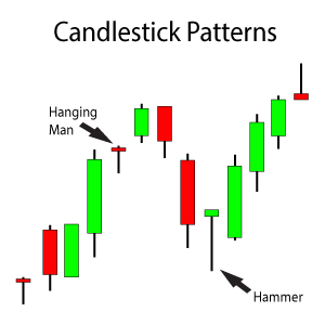
What I notice when looking at this chart is a resistance area overhead from the Shooting Star candlestick pattern and support below from 2 bullish candlestick patterns, a Hammer candlestick pattern and a Piercing candlestick pattern. The secondary support area from the Hammer candlestick pattern and the support area Piercing candlestick pattern are almost identical. This is the $66 price level.
And where is NSRGY’s share price? In no man’s land, right in the middle of the support and resistance area.

Analyzing a 20 Year Monthly Candlestick Nestle (NSRGY) Stock Chart to Look for Support and Resistance Areas
The support from the bullish candlestick patterns seem to outweigh the resistance from the bearish Shooting Star candlestick pattern. If you want to read more about any of the candlestick patterns mentioned, please visit[s2If !current_user_can(access_s2member_level1)]….
If you want to continue reading this Nestle (NSRGY) stock chart review and analysis, you must first login.
I look at some pullback areas to begin building a position in the stock as well as review some of my previous upside price targets for both the shorter and longer-term.
If you are not a Trendy Stock Charts member, consider joining today! There are several different subscription plans available.[/s2If][s2If current_user_can(access_s2member_level1)] the Advanced Candlestick Patterns page for Trendy Stock Chart members only. You can access the individual webpages for each of the above candlestick patterns I’ve identified if you want to learn about their requirements and characteristics.
NSRGY – Support Areas
This next chart is a 5 year weekly candlestick chart to analyze some support and resistance areas with a little more detail that a weekly chart provides over a monthly chart.
I placed a Fibonacci Extension Tool on the chart to measure downside price targets if NSRGY’s share price continues is downtrend from the previous 2 weeks.

Reviewing a Weekly Candlestick Chart for Nestle (NSRGY) to Analyze Its Support and Resistance Areas in More Detail
The $66 – $68 price level looks to be the optimal price area to make an initial scale-in purchase to go long on Nestle shares. Do be aware though that a quick break below the $66 area could happen. If it does, do not panic. It should rebound sharply from the $62 price level or right around the 100% Target Line from the black Fibonacci Extension Tool. Instead, use any pullback to that area to make a second scale-in purchase of shares.
Any pullback below the $68 price area is most likely going to develop over a several week period. Therefore, it may be best to set some price alerts in your trading platform rather than trying to monitor the stock daily.
The MACD Histogram does show the largest amount of selling volume that NSRGY’s share price has seen over the last 5 years. Could this be an indicator of worse things to come?
NSRGY – P&F Chart
This last chart comes from stockcharts.com and is a Point & Figure chart. There is only 1 setting that I like to change when I look at a Point & Figure chart. I switch between the intra-day high/low setting and the closing setting when I am looking for potential upside target prices. Hopefully both charts indicate higher prices, giving me more confidence that higher prices are truly in store for the company’s share price.
This is a P&F chart based on intra-day highs and lows. It shows a bearish price objective of $51.

Analyzing a $51 Bearish Price Objective Calculated by this Point & Figure Nestle (NSRGY) Stock Chart
When I switched the settings to closing share prices only instead of intra-day highs and lows, the bearish price objective was almost identical. It was $52 instead of $51.
The $52 price level agrees with the 161.8% Target Line from the black Fibonacci Extension Tool on the above weekly chart. The price target is at the very bottom, right-hand corner of the chart. It reflects a $51.13 price objective. That was not even a price target I considered because of the bullish candlestick patterns noted on the monthly chart. The bullish candlestick patterns had support around the $66 price level.
To reach the $51 price level, bad news or a bad earnings report would have to be issued while NSRGY’s share price is already near the bottom of the $66 support area, causing a break below the support area on heavy selling volume.
Nestle (NSRGY) Stock Chart Summary
Since Nestle’s share price is currently in between its longer-term support and resistance areas, it seems as if patience is the best option at this particular moment in time. Especially based on the ultra-bearish price targets calculated by the Point & Figure chart.
The $66-$68 and the $61 support areas I identified above could be price levels to go long, but mostly as a trade rather than as an investment. Purchasing shares as a trade can sometimes turn favorable and then turn into an investment. But it can’t turn favorable if you don’t trade it and give it a chance.
If NRGY is truly heading towards the $51 price level, it most likely will be a grind it out lower downtrend rathe than a fast and fierce one. Any trip to the $51 price level is most likely still months away. Some form of bad news or a horrible earnings report would most likely be the culprit to cause the break of the $66 price area.
If by chance there is a breakout and NSRGY’s share price makes a new all-time high before pulling back to the $66 price level, make an immediate scale-in purchase at that time. A continued breakout will be following soon thereafter.
Waiting for a stock is never easy. But waiting appears to be the best move in this case – waiting for NSRGY to make the next move from its current location right in the middle of longer-term support and resistance areas. It’s your move Nestle!
Good luck trading!
On deck: US Bancorp
[/s2If]


Ask a Question. Make a Comment. Leave a Reply.